Android
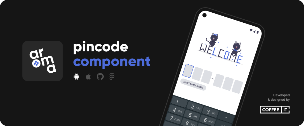
The Android Aroma Pincode package provides a highly customisable pincode view.
⚡ Installation
This component requires minimum SDK 21.
Add the dependency to build.gradle.
Groovy:
dependencies {
    implementation "nl.coffeeit.aroma:pincode:1.0.3"
}
KTS:
dependencies {
    implementation("nl.coffeeit.aroma:pincode:1.0.3")
}
📖 Usage
To use the component as in a Compose project, simply add it to your code as is. This example showcases a simple version:
PincodeView(
    pincodeLiveData = pincode,
    isErrorLiveData = isError,
    enableSendButton = true,
    onPincodeCompleted = {
        // Pin code filled in
    },
    onSend = {
        // Send button clicked
    }
)
To use the component as part of a XML-based project, add a ComposeView element to your layout file and call the setContent method in your activity/fragment:
lateinit var binding: ActivityMainBinding
    private val isError = MutableLiveData(false)
    private val pincode = MutableLiveData("")
    override fun onCreate(savedInstanceState: Bundle?) {
        super.onCreate(savedInstanceState)
        binding = DataBindingUtil.setContentView(this, R.layout.activity_main)
        binding.cvPincode.setContent {
            PincodeView(pincodeLiveData = pincode, isErrorLiveData = isError)
        }
    }
⚙️ Customisation
PincodeView accepts the following optional parameters for in depth customisation:
lengthOfCode- An integer that decides the length of the pincode (default 6)inputWidth-Dpobject to set width of each input cellinputCornerShape-RoundedCornerShapeobject to set rounded corners on the input cells- Example:
RoundedCornerShape(12.dp)
- Example:
inputColors-TextFieldColorsobject to determine the colors in and around the input cellsinputSpacing-Dpobject to set the spacing betweens each input cellshowDividerAfterInput- decides after how many cells a divider should be showndividerColor- the color of the dividerdividerHeight- the height of the divider inDperrorText- shown text when the component is in an error stateerrorLabelPaddingVertical- the vertical padding of the error label inDpfocusedBorderThickness- border thickness of the cells when focusedunfocusedBorderThickness- border thickness of the cells when not focusedinputTextStyle-TextStyleobject to determine the text style of inputsinputErrorTextStyle-TextStyleobject to determine the text style of inputs when in error stateerrorLabelTextStyle-TextStyleobject to determine the text style of the error labelsendButtonTextStyle-TextStyleobject to determine the text style of the send buttonsendButtonDisabledTextStyle-TextStyleobject to determine the text style of the error label when disabledonlyDigits-Booleanto make the component accept only digitsautoFocusFirstInput-Booleanto make the component focus the first input automaticallyresetPincodeLiveData-Unitthat runs when the PincodeLiveDatagets resetonBack-Unitthat runs when the back button is pressedonPincodeCompleted-Unitthat runs when all cells are filled inenableSendButton- Enables the send buttonsendButtonConfiguration- SendButtonConfiguration- Example:
SendButtonConfiguration(text = "Send code", cornerShape = RoundedCornerShape(12.Dp), alignment = ButtonPosition.START
- Example:
sendButtonConfigurationDisabled- SendButtonConfiguration when send button is disabledsendCooldownDuration- integer in seconds, to determine how long the send button should be disabled for when clickedonSend-Unitthat runs when the send button is clickedpincodeLiveData-LiveDataobject of aString. ThisObjectwill be updated to reflect the Pincode characters in the UI.isErrorLiveDataLiveDataobject of aBoolean. ThisBooleandetermines whether the Pincode view is in an error state or not.sendCodeLiveData-LiveDataobject of aBoolean. When thisBooleanis set totrueonSendis triggered, the timer starts counting down and the send button gets disabled. Should be set tofalseto be able to use it again.keyEventInErrorState-Unitthat runs when a key is pressed while the component is in an error state
✏️ Changelog
The changelog can be found here.
⚠️ License
Android Aroma Pincode is licensed under the terms of the MIT Open Source license.