iOS
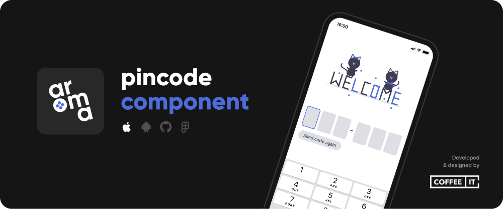
The CITPincode package provides a customizable pincode view. It includes an optional resend code button with a built-in cooldown and an optional divider to be placed anywhere between the cells.
⚡ Installation
🔨 SwiftPM
To install the Swift Package, go to Project > Package Dependencies > + > Search or Enter Package URL > Fill in:
https://github.com/Coffee-IT-Development/Pincode-iOS-Component
📖 Usage
Import CITPincode and add a CITPincodeView to your SwiftUI view.
import SwiftUI
import CITPincode

struct CITPincodeExampleView: View {
    @State private var code = ""
    @State private var error: String?
    @State private var forceCooldownOnce = false

    var body: some View {
        CITPincodeView(
            code: $code,
            error: $error,
            forceCooldownOnce: $forceCooldownOnce,
            config: .example,
            onEnteredCode: sendCode,
            onResendCode: sendCode
        )
        .onAppear {
            forceCooldownOnce = true
            sendCode()
        }
    }

    private func sendCode() {

    }
}
Extra details:
- The error can be set to any text message or nil, the CITPincodeView will update dynamically.
- The code input can be used realtime via the code binding, but the code is also automatically passed to the onEnteredCode method once enough characters have been entered.
- The CITPincodeView is set to receive One Time Passcode(s) and can alternatively be long pressed to let the user paste a code directly from their clipboard.
⚙️ Customization
/// The length of the pincode.
/// Determines amount of shown pincode cells as well as how many characters have to be entered before the code is checked.
public var codeLength: Int

/// The font used to display text within the pincode cells.
public var font: Font

/// The font used to display the error message if any error is visible.
public var errorFont: Font

/// The color of the text within the pincode cells.
public var textColor: Color

/// The color of the error message if visible.
public var errorColor: Color

/// An optional placeholder code, shown within the pincode cells, should be entire codeLength if displayed at all,
/// each placeholder character individually checks if there's no input at its position, and will be shown if there's none.
public var placeholder: String

/// The color of the shown placeholder text shown within cells if any.
public var placeholderColor: Color

/// The background color of pincode cells.
public var backgroundColor: Color

/// The background color of a pincode cell when it is currently selected, a cell is selected when that cell would be filled with the next entered pincode character.
public var selectedBackgroundColor: Color

/// The border color of any selected pincode cell.
public var selectedBorderColor: Color

/// The border width of any selected pincode cell.
public var selectedBorderWidth: CGFloat

/// If set to true, all pincode cells will always be shown as if they are selected.
public var alwaysShowSelectedBorder: Bool

/// If set to true, the keyboard will show once the pincode view appears.
public var showKeyboardOnAppear: Bool

/// Text shown for the button that can close the keyboard from a toolbar.
public var keyboardDoneButtonText: String

/// The size of each pincode cell.
public var cellSize: CGSize

/// The cornerRadius of each pincode cell, used to set rounded corners, e.g. set to 0 for sharp corners, to 8 for small rounding or .infinity for maximum rounding.
public var cellCornerRadius: CGFloat

/// The type of pincode, you can choose any UIKeyboardType, but the most common types are ".default" for a text keyboard and .numberPad for a numbers only keyboard.
public var keyboardType: UIKeyboardType

/// These characters will be filtered out if a code is pasted via clipboard on long press. It replaces occurences with an empty string.
public var charactersToFilterOutOnPaste: [String]

/// Optional config used to show a single divider somewhere between the pincode cells. Does not impact user input, and can be customized slightly.
public var divider: CITPincodeDividerConfig

/// Optional config used to show a resendButton, meant to resend an One Time Passcode on press and is automatically disabled for a given cooldown duration to limit usage.
public var resendButton: CITPincodeResendButtonConfig

/// Returns the configured resendButtonStyle, used to display the resendButton if present.
public var resendButtonStyle: CITPincodeResendButtonStyle

/// Returns the configured dividerStyle, used to display the divider if present.
public var dividerStyle: CITPincodeDividerStyle

/// Defines the style that configures an optional resendButton that is meant to resend an One Time Passcode on press.
/// This resend button will be disabled for the given cooldown if any and automatically re-enable itself once the cooldown duration has passed.
/// - Use `.custom` to set `text, font, textColor, backgroundColor, contentInsets, cornerRadius, cooldown, alignment`.
/// - Use `.plain` to set `text, font, cooldown, alignment` and use default values for the other fields.
/// - Use `.none` when no resend button should be shown.
///
public enum CITPincodeResendButtonConfiguration: Equatable

/// The style of a shown divider if any.
/// - Use `.custom` to set `afterIndex, color, size & cornerRadius`.
/// - Use `.plain` to set `afterIndex` and use default values for the other fields.
/// - Use `.none` when no divider should be shown.
///
public enum CITPincodeDividerConfiguration: Equatable
✏️ Changelog
The changelog can be found here.
⚠️ License
Distributed under the MIT License. See LICENSE for more information.